Pastel colors are the best solution for the design of an office, home or apartment. They are calm and unobtrusive, have a calming and relaxing effect. A room decorated in such color tones provides spiritual comfort. But this is not the only thing that attracts modern designers and apartment owners.
Pastel colors are always a win-win: it is almost impossible to make a mistake when using it, and it is easy to work with. It harmonizes with any colors, materials, styles.
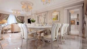
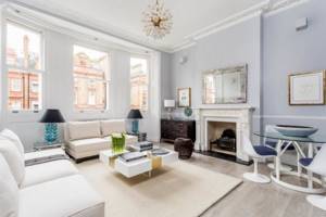
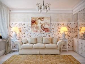
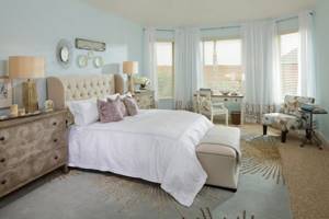
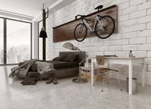
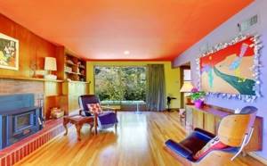
French classic interior Source zilli-interior.ru
Design features
Pastel shades are considered to be diluted with white. Visually, it looks like a white veil has been applied to an ordinary pure tone. The result is a pleasant, light shade.
Considering the nature of the pastel palette, it would be a good interior solution to use it to decorate small rooms. Light wallpaper will visually increase the space.
Pastel goes well with white and gray tones, as well as with brighter manifestations of its shade.
Pastel colors look good both as a background and as accents.
For rooms with windows facing north, it is better to choose pastel wallpaper in a warm tone, such as yellow or peach. Cool tones, blue, mint, lavender, are suitable for the south side.
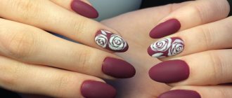
Pastel manicure on long nails
How do I recommend decorating long nails? The pastel color palette is one of the most beautiful. And it looks most advantageous in a multi-colored design on long nails. Lots of beautiful ideas with French variations. “Aquarium” design and aqua-drops, painting with gel paints and stamping are also relevant. Glittering decor will add a special charm to almond-shaped nails.
Color selection
Pastel pink
An incredibly delicate and light pastel tone is associated with powdery rose petals. Soft pink wallpaper looks good in the interior of a children's room for girls, a bedroom, a living room and other rooms in the house.
Pastel yellow
Positive sunny unobtrusive pastel tone. It will look harmonious in the interior with neutral basic colors such as white and beige. Pale yellow wallpaper will brighten up a room whose windows face north.
Light peach and light coral
Tones that are close to each other will add color to the interior and make it brighter. They will look harmonious with turquoise and blue colors. Peach will be harmonious as the base color of the walls. Coral tone is more suitable as a bright accent.
Pastel lilac and lavender
Soft purple goes well with white and gray. The ideal wallpaper tone for decorating a living space in a classic or Provence style, the design will be fresh and cozy.
Pastel green and mint
Pastel green walls not only look refreshing, but will also have a positive effect on the psychological side of a person. Mint is a suitable option for an interior in the style of shabby chic and Provence; green shades will look warmer.
Pastel blue
Soft pastel blue will be associated with summer skies and clear water. Cool shades of wallpaper are best used for interior design with south-facing windows.
Cream, ivory
Cream pastel wallpaper is ideal as a background, it is not as bright as white and looks much softer. Both shades of pastel will be harmonious in classic and modern styles. The interior can be diluted with details of other, brighter colors.
Bouquets with tulips
Tulips are a spring classic, and bouquets of them are always relevant. They are one of the first to appear and delight with a riot of colors from literally all sides. Moreover, there are hundreds of the most bizarre varieties, and breeders are constantly developing new ones.
Tulips do not need complex packaging, because an armful of flowers is beautiful in itself. Thanks to the long stems, you can collect interesting cascading or spherical compositions. By the way, tulips also look great in bouquets with other flowers. For example, with roses, hyacinths or callas.
Bouquets of white, lilac or pink tones with a delicate ribbon look gentle and elegant. This is a great choice not only for holidays, but also for a first date. And if you want something more spectacular, you have black, purple, two-color, terry and other extravagant varieties at your disposal.
Photo: mykaleidoscope.ru Photo: semicvetic.com
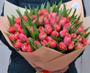
Photo: bigbookname.com
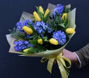
Photo: flowershopcats.ru Photo: rci76.ru
Pastel: combination with other colors
The combination of romantic colors with white remains the most popular. This combination visually makes the room more voluminous and gives it a certain solemnity.
Another win-win way to harmoniously combine a pastel shade with another is to choose a tone from the same range as a second color, but with greater or less intensity:
- olive goes well with green and rich light green;
- caramel finds its continuation in brown;
- dusty coral is perfectly complemented by salmon and other shades of orange.
When choosing a pastel shade as the dominant one in the interior, do not forget to focus on tables of harmonious color combinations.
The combination of all pastel shades is almost limitless. This range perfectly coexists with both related shades and contrasting bright colors, which act as design accents and at the same time emphasize the delicacy of soft tones.
Bouquet of flowers for birthday
What flowers should I give for my birthday? Of course, those that will delight the recipient! Traditionally, delicate shades are perfect for young people, while rich and bright shades are perfect for loved ones.
Compositions made from multi-colored tulips, delicate Japanese eustomas or exotic orchids look impressive. Bright gerberas symbolize fun and joy, and chrysanthemums delight with a variety of varieties and shades. Daffodils are beautiful and charming, and lilies in large bouquets turn into a real fairy tale.
Callas can be given even to men, and especially to colleagues. In addition, gladioli, irises and carnations are considered male flowers. Even roses can be chosen with meaning. Red ones are about love, white ones are about purity and care, burgundy ones are about elegance, pink ones are about tenderness and romance, and yellow and orange ones are about happiness and fun.
Photo: youtube.com

Photo: my.mail.ru Photo: sancaktepeciceksiparisi.com Photo: les-tish.ru Photo: ok.ru
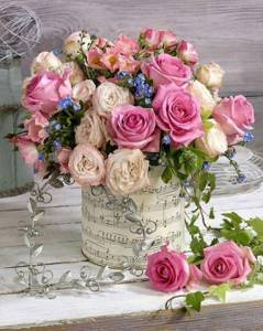
Photo: aliexpress.ru
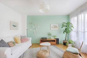
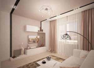
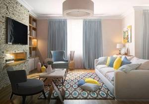
Living room in pastel colors
When decorating a room with windows facing north, you should take a closer look at the warm shades of pastel. Soft peach, cozy brown or sunny sand will gently fill the room with warmth, making up for the lack of light in the room.
But such colors can visually reduce the space, so in a small room use warm tones with caution.
Mint with neon echoes, turquoise, noble gray, exquisite pearl or muted pastel ultramarine are suitable for spacious living rooms located on the south side of the building. Here, cool pastel shades will balance the abundance of light and fit harmoniously into the interior.
To reduce the dominance of pastel colors, dilute the interior with bright colorful highlights. Furniture and decorative items in rich tones will attract attention and become the center of the interior composition.
You can diversify the living room design in a similar manner by using bright decorative pillows for the sofa, ceramic vases and flower pots, contrasting curtains, floor lamps or sconces.
Pastel manicure on short nails
The use of pastel shades is especially important for short nails. To add tenderness, use a variety of patterns of fresh flowers, zigzags and textures. Creating a French manicure with pastel nail tips will make the manicure sophisticated and, again, delicate. Another way to liven up your design and make it fashionable is to combine pastels with sparkling decor. Rubbing, thin foil and glitter will do the job perfectly.
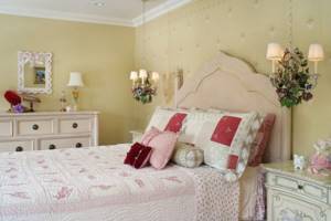
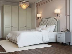
Bedroom and the charm of pastel colors
The calming effect of pastel colors is indispensable in the room in which a person spends most of his time. Evening rest and night's sleep largely depend on the environment, so the choice of colors for the bedroom should be given special attention.
Green color calms the nervous system, so its pastel shades are successfully used to create a small bedroom design. You can complement delicate olive with warm lemon. With moderate use of the latter, an interesting contrast of warm and cold spectra is achieved, which will not be flashy and depressing.
When choosing the color of the walls in a woman's bedroom, you should take a closer look at all the pastel tones of pink and the current powder color. This coloring is considered truly girlish and will evoke positive emotions among the fair sex.
The white and brown combination is suitable for couples' bedrooms. Bed linen in the appropriate color scheme will help complement the interior: choose sets with a pattern that will echo the print of the curtains or wallpaper.
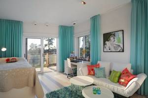
Pastel colors for a children's room
Soft combinations of pastel shades are successfully used by designers when planning the decoration of a nursery.
This palette has a positive effect on active and excitable babies.
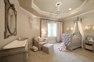
For boys, classic shades of blue, dove-gray, olive and an interesting combination of turquoise-brown details are suitable as the dominant tones in the room. To realize the last combination, just paint the walls turquoise and add natural wood furniture to the room.
Bookshelves, a wardrobe and a bed in wenge color will organically emphasize the soft but rich primary color of the interior.
Little princesses will love pink, peach, gold and lavender colors. You can decorate the interior of a child's room for a girl using a light canopy, cute lace decor on bed linen, and translucent airy tulle.
Large and luxurious bouquets of flowers
To make a large bouquet look truly chic and harmonious, you will have to work on it. The classics are roses, but in fact tulips, peonies or chrysanthemums look nothing like them. Or you can use a trick and collect a bouquet of hydrangeas. Its secret is that even a dozen branches is already a huge armful.
Most often, large bouquets are collected in the form of a ball, laying each new row in a spiral with a slope. No extra decor is needed, the maximum is simple wrapping paper tied with ribbon or lace. Chic large bouquets can most often be seen at weddings or anniversaries, but is the occasion really that important?
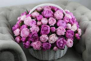
Photo: vseosvadibe.ru Photo: bella-roza.ru
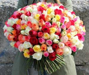
Photo: flowerbunker.ru Photo: ne-kurim.ru Photo: dostavka-tsvety.ru
Did you like the post? Subscribe to our channel in Yandex.Zen, it really helps us in our development!
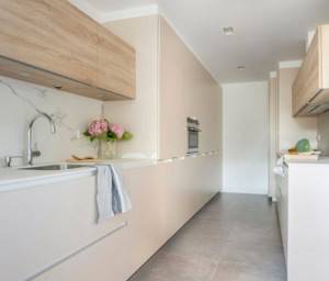
Kitchen and pastel palette of shades
The beige-brown palette is the optimal color solution for decorating the kitchen. The softness of beige is elegantly emphasized by the warmth of the chocolate tone. These colors are appropriate not only when choosing tiles or kitchen facades.
A golden-beige refrigerator, a caramel-brown oven or a microwave oven will also harmoniously fit into the interior and serve as a “highlight” of the final decoration.
Light colors when planning a kitchen design visually enlarge a limited space. If your kitchen does not have a lot of square meters, play up the compact area with a dominant pastel tone:
- pearl;
- dairy;
- olive;
- violet.
The light color scheme is quite difficult to care for. But this drawback is fully compensated by the elegance that noble pastel colors bestow on the kitchen.
Bouquets of wild flowers
Bouquets of wildflowers are always very touching, tender and charming. In addition, they are always unique, because it is very difficult to repeat a composition from different plants. Carnations, dandelions, cornflowers, forget-me-nots, daisies, poppies, bells, fireweed, clover - this is only a small part of the options.
Most often, the flowers in such bouquets are quite small, but very bright and colorful. Therefore, it is better to stick to one color scheme or collect a lush armful of plants of the same species. But you need to understand that most wildflowers do not stand up very well in a vase, especially varieties with large delicate petals, like poppies.
Photo: koffkindom.ru
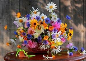
Photo: fotokto.ru
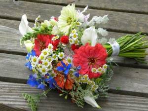
Photo: anzherosudzhensk.rozarioflowers.ru
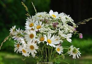
Photo: culture.ru Photo: cvety4you.ru
Happy Birthday Cards: Pictures and Photos

Pastel shades for the bathroom
Light and delicate pastel shades fit harmoniously into the interior of the bathroom. The abundance of white items allows you to appropriately combine other colors, complemented by a white color scheme.
- A bathroom in blue tones remains a classic example of the embodiment of pastels in a design project. Textiles and lighting will help refresh the cold spectrum: you just need to choose towels and soft sets of carpets with long pile in a rich warm color, for example, peach.
- Soft green is also appropriate in the bathroom. Tile of two shades from the same palette is organically complemented by a floor in a neutral tone, for example, light gray. You can emphasize the special style of the room with the help of glossy stretch ceilings in the same bluish shade.
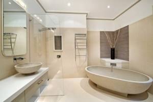
Turquoise and mint are another win-win color scheme for the bathroom. , textiles and accessories can also be selected in this shade
- toothbrush holders;
- towel holders;
- shower curtain.
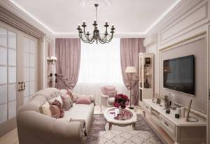
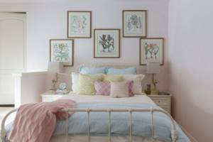
Delicate bedroom interior: fashionable ideas
Powdered pink, soft purple or fresh mint are subtle shades that never go out of style. So, think about decorating your bedroom. Of course, thanks to these colors the room will acquire a cozy and gentle atmosphere. What accessories should you use to give the room even more lightness and sophistication?
An interior design based on subtle shades will certainly bring a lot of light into the room and make the space seem larger. Simple forms and minimalism in the interior are assumptions of the Scandinavian style. The color that predominates in this style is classic white. This tone goes perfectly with pastels. Combining them in the bedroom is an excellent solution, which is now becoming increasingly popular.
Advantages and disadvantages
Let's consider the advantages of using light shades in apartment design.
- The space of a small room visually expands. The main thing is not to forget about bright accents.
- The sun's rays are reflected from the light finish, so rooms with windows on the sunny side will not be too hot. And the whole situation becomes airy.
- Neutral colors can be easily combined with bright textiles, panels, and carpets.
- A bright environment can be easily refreshed with curtains, pillows, and blankets.
- Light colors will always be relevant.
- Dust and other imperfections are invisible in white.
But light colors also have disadvantages:
- discomfort (you may feel like you are in a hospital);
- impracticality;
- facelessness;
- emotional people experience feelings of apathy, depression and psychological pressure.
Decor
Accent decorative elements (furniture sets, small accessories, textiles) are a prerequisite for decorating an apartment in light colors.
Otherwise, the room will seem boring.
There are certain rules for choosing accents.
- The main thing is to maintain balance: 60 percent - the main background, 30 percent - additional colors and only 10 percent - accent.
- Do not use many small parts.
- For a basic light color scheme, use eye-catching bright accents. With light walls, you can use multi-colored accent items that should be in harmony with each other.
- Increase the number of accents if there is no additional color.
Light shades are suitable for interior design in the following styles:
- modern;
- classic;
- minimalism;
- neoclassical;
- eco;
- Scandinavian;
- Provence;
- loft.
Delicate manicure in geometry style: photo 2022
Pastel nude tones are considered the ideal base for geometry manicure. A gentle manicure in the geometry style will highlight your individual style and draw attention to your nails thanks to interesting patterns. Different lines, dots and geometric shapes can be placed in different ways on the nail plate. For interesting ideas on how to design a delicate geometric manicure 2022, see our photo selection:
A color scheme
Combination with neutral shades
To achieve the most light and delicate interior, the most successful combination would be with neutral shades such as white and light gray. Both colors combine harmoniously with almost the entire color palette, and when combined with pastel tones, they form a romantic and relaxing design.
Monochromatic
This is a combination of one color of different saturation, from white pastel to deep shade. In the interior, such a combination can be found in the decoration or filling of the room, for example, wallpaper with a smoothly flowing pattern or a sofa with brighter pillows and blankets.
Complementary
Opposite shades from the color wheel, such as soft pink and blue, are considered complementary. In apartment design, this combination looks brighter and more interesting. Despite the contrasting colors, the room will not be overloaded due to soft shades.
Similar
The shades adjacent in the circle will become a continuation of each other in the interior of the room. The shades are close to each other, but are not variations of the same color.
Stylish ideas for pale pink manicure
Pink color is rich in its various shades. The most popular colors: lilac, pink cherry, pale pink. More saturated colors of pink are Mexico, steel pink and deep pink. If you choose a manicure technique, your favorites are monochromatic manicures, geometry, nail designs with florists, and manicures with silver glitter. A manicure with rubbing and a foam manicure looks chic and beautiful.
Furniture and decor
Furniture
Pieces of furniture in pastel colors can become either the main object of attention in the interior or be a laconic and inconspicuous addition. For example, a vintage chest of drawers or a pale lavender velvet chair at the dressing table will certainly attract attention, and a cream-colored sofa or dining table will become a continuation of the design idea.
Curtains
Tulle of one color or another can change the perception of the room, for example, a light yellow or peach shade will make the room warmer, and blue, lilac or mint, on the contrary, will refresh it. Curtains made of thick fabric will protect from excess light, while preserving space.
Textile
The textile part of the design makes the interior cozy. Pillows, throws and rugs are details that can slightly change the mood of the home, making it playful, for example, with a floral pattern on a pink background, or romantic with plain soft lavender accents.
Paintings and posters
Paintings even in the same color palette can look completely different, depending on the writing technique and image style. The drawing can support the overall stylistic direction or reflect a thematic idea.
Accessories
Decorative interior items are the finishing touch in creating an apartment design. Candlesticks, ceramic figurines or flower vases will add romantic notes to the interior of the room. In the nursery these can be beautiful dolls, soft toys or night lights, in the kitchen decorative wall plates or useful little things, and in the bathroom a rug, boxes or cups for brushes and soap.
Delicate manicure with the inscription 2022
A simple, but at the same time quite effective manicure with inscriptions is a real fashion hit of the 2022 season. Choose playful phrases, slogans, declarations of love or quotes from your favorite books and films. You can apply them yourself using a fine brush or slider design. Each of the options looks interesting in its own way.
The original inscription will decorate both short and long nails; this is a great idea for a delicate manicure design.
Options for color combinations of individual parts of the interior
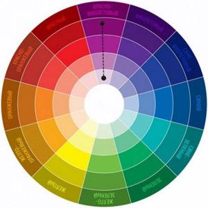
A comfortable combination of colors in the interior of a house is very important for its residents. Correctly selected tones create an amazing design, and mistakes in combination lead to imbalance in family relationships. Designers recommend using special tables, so-called circles, which help even an amateur create a beautiful look.
This circle is used for basic paint selection. The circle has three levels. The inner one contains three main shades - yellow, red, blue.
Their pairwise combination gives three secondary tones - purple, orange, green. The third outer circle contains tertiary colors, the result of combining secondary and primary colors. Based on these shades, combinations are selected.
There are several principles for forming combinations:
- Analogue triad - several shades located next to each other, usually choosing from 2 to 4 shades.
- Contrasting - take 2 tones located opposite each other.
- Complementary triad , instead of a contrasting one, 2 shades adjacent to this tone are used.
- A double divided contrast scheme is formed in two ways: according to an inscribed square - you need to take every third shade in a circle, or according to an inscribed rectangle - the lower two through one and also contrasting to them according to the same principle.
- Three-color triad , they take one basic one and complement it with two additional shades three shades from the basic one.
In addition, we must not forget about the universal white, gray and black.
Important! The main tone should occupy 65% of the total space of the room, 35% should be occupied by additional elements in approximately equal quantities and 5% by accented elements.
Simple photo processing in soft colors
/ Sergey Nuykin / Photo processing
Friends, I am glad to welcome you! Today on photodizart.ru there is again a small lesson on photo processing in Photoshop. We will process photos in soft colors, using a gradient toning effect. Thanks to this lesson, you can easily add new colorful shades to your photos and make the tones more delicate. The lesson will take us very little time, and you will see for yourself how simple photo processing in Photoshop can be.
Let's get started, open Photoshop and upload the photo. Below I have attached a screenshot before and after processing, as you can see the effect is quite interesting, and when you get acquainted with the lesson you will understand that it is not complicated at all.
The first step is to correct the red tint using hue/saturation. Add a new hue/saturation by clicking on the icon at the bottom of the layers window. Or go to Layers > New Adjustment Layer > Hue/Saturation . Then we’ll adjust the adjustment layer by reducing the saturation, in my case it’s -54 .
The next step is to tone our photo using gradient toning, as in the previous step, create a new adjustment layer, gradient map. To do this, click on the icon at the bottom of the layers window “create a new adjustment layer or fill layer.” In the menu that appears, select gradient map . Let’s set it up, to do this, click on the gradient in the “correction (gradient map)” window; in the “ gradient editor ” window that appears, select the standard gradient ( purple, orange ), and change its orange color to # ebdbcc. And for this layer we will set the blending mode to “screen ”.

Next I want to lighten one edge of the photo, I will use a simple brush ( B) with soft edges and opacity at 24% . To do this, create a new layer ( Shift+ Ctrl+ N ), set up a brush, select white if there is none, and drag the brush over the right side of the photo, thereby lightening it slightly.

As you can see from the screenshot, the photo is already in soft colors, but I want to add contrast. I will do this in a simple way, create a new layer ( Shift+ Ctrl+ N ), fill it with black and set its blending mode to “ soft light ”. And let’s slightly reduce the influence of this layer on our photo, for this we will reduce the opacity to 80% (yours may be more or less depending on the photo).
That's all the photo processing in Photoshop is completed, as a result we received a processed photo in soft colors. The lesson is quite simple, the effect is decent. Try experimenting with your photographs, give them soft tones.
Don’t forget to subscribe to new articles and lessons on the site, then you will be the first to know about them.
How to choose a combination of floor and wall colors?
The modern construction industry offers a huge selection of finishing materials to suit every taste and budget. The article will help you choose the materials and their combinations that are right for you.
An important aspect of room decor is a well-chosen combination of floor and door colors. Designers identify three win-win options for the ideal combination of shades in the interior - dark doors, light baseboards and dark floors.
Black, brown, dark gray tones of the floor and doors add elegance and sophistication to the most modest home.
The combination of a dark floor and furniture of light shades will “dilute” the darkness of the dark texture and the room will be filled with life-affirming colors.
The second fashionable direction of decor is the interweaving of white or beige doors and floors with pastel-colored skirting boards. This interior option welcomes the presence of dark-colored furniture.
The trend of the season is Wenge furniture - an ideal solution for a country house or large apartment. For small apartments or children's rooms, light furniture and doors, floors and walls in pastel colors are quite suitable.
The third housing design option is a game of contrasts. Bright colors of curtains, neutral tones of doors and furniture in various shades of wood.
The unusual and original appearance of such rooms pleases the eye, but prolonged “admiration” can have negative consequences. This range of colors is more suitable for an entrance hall or a wide hall of a country house.
When choosing a floor tone, you need to focus not only on your preferences, but also on the shades of the walls and ceiling. A dark floor made of natural materials or laminate will make a room with a light ceiling and walls visually larger.
Dark floors and ceilings in tandem with light walls will visually remove the excessive height of the room and increase the room horizontally. Light floors, wallpaper and a white ceiling will elevate the height of the room.
A tall room with light floors and dark walls and a light ceiling will look more cozy. A special floor + walls table gives a complete picture of the compatibility of the range of colors.
An important nuance is the interweaving of the colors of the door and the floor. How to figure it out and create a unique masterpiece at home?
- The gray floor harmonizes perfectly with light blue, yellow-green and pastel green shades, pink, brown and white, and, of course, gray. Now we use common sense and from the resulting variety, choose an acceptable tone for painting the doors.
- It will probably be brown, white or grey. If such combinations do not suit you, then you should pay attention to colors that are in harmony with each other from the same table.
- You can also choose the appropriate shade of doors to match the brown floor and others. Using the same table, you can select wallpaper tones to match a gray floor or the appearance of a floor to match gray wallpaper.
Beautiful bouquets of roses
Roses are beautiful in themselves, but even a bouquet of roses needs to be arranged correctly. Free assembly without the limitations of imagination does not always look good both in real life and in photos. You can try a one-sided arrangement, when all the components of the bouquet are turned in one direction. Or another popular option - tiered.
Round bouquets of roses, collected in a spiral in the shape of a ball, look stylish and large-scale. And it’s better to leave the giant armfuls completely without packaging or decoration, in one or two shades. Finally, bouquets of roses can always be combined with other flowers, although at least basic knowledge of floristry will not hurt here.
Photo: sch1980uz.mskobr.ru Photo: family-flo.ru Photo: zen.yandex.ru Photo: yandex.com
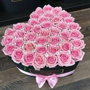
Photo: fi.pinterest.com
Postcards and pictures “Good morning!”

Ceiling
Traditionally, the ceiling is painted in light colors; light shades of suspended ceilings or ceiling tiles are used.
But this trend is not a dogma at all. Other options for painting the ceiling are quite possible, especially if it is a children's room or living room.
Of course, it’s better not to experiment in the bedroom, but, again, you should listen to your desires.
Delicate makeup with arrows

To create beautiful and delicate makeup for every day, it is not necessary to resort to various complex techniques or unusual cosmetics. Simply apply one shade of eyeshadow to the eyelid and draw a neat liner.
Types of arrows for delicate makeup:
- Basic;
- Classic thin;
- With a short ponytail;
- Half-hearted.
At the peak of popularity in 2022 is delicate makeup with classic white wings.

Draw arrows using liquid eyeliner, soft pencil or shadows. Shades are chosen in accordance with the purpose of the makeup. The most popular colors are:
- Black;
- Brown;
- White;
- Golden.
As a basis for the arrows, you can choose pearlescent shadows in light brown, gray, beige and pink shades. Eyeliners on the eyelids with nude shadows and transparent shimmer will look good.
You can create a simple and delicate evening eye makeup with arrows in just three steps:
- Application of basic shadows: champagne, peach, coral, cinnamon. You can take shadows with a pearlescent finish or add golden glitter;
- Drawing arrows that suit the occasion. For evening make-up, classic ones or ones with an upturned corner are suitable;
- Eyelash dyeing.
It is better to choose lipstick for such makeup in muted shades: brown or plum, without a shiny finish. It is also possible to use shades of fuchsia, terracotta or amethyst nuance, corduroy and flamingo color.
Door color
The fashion trend of the season is wenge-colored doors. A deep dark shade with a clear, lighter grain of natural wood gives the doors a noble appearance.
Modern industry offers a huge selection of doors of various colors, from a wide variety of materials.